Report editor
Introduction
The report editor is the core component of the app, providing a comprehensive view of all the data in your database. Its primary objective is to offer a customizable interface for displaying data according to individual preferences, rather than relying on default or predefined views. We recognize that each customer has unique needs, and our goal is to accommodate these diverse requirements. Currently, data can only be displayed in a table format, but we are actively working on adding charts and maps to enhance the visualization options available to our users. This will allow for a more dynamic and visually engaging representation of data, catering to various analytical needs.
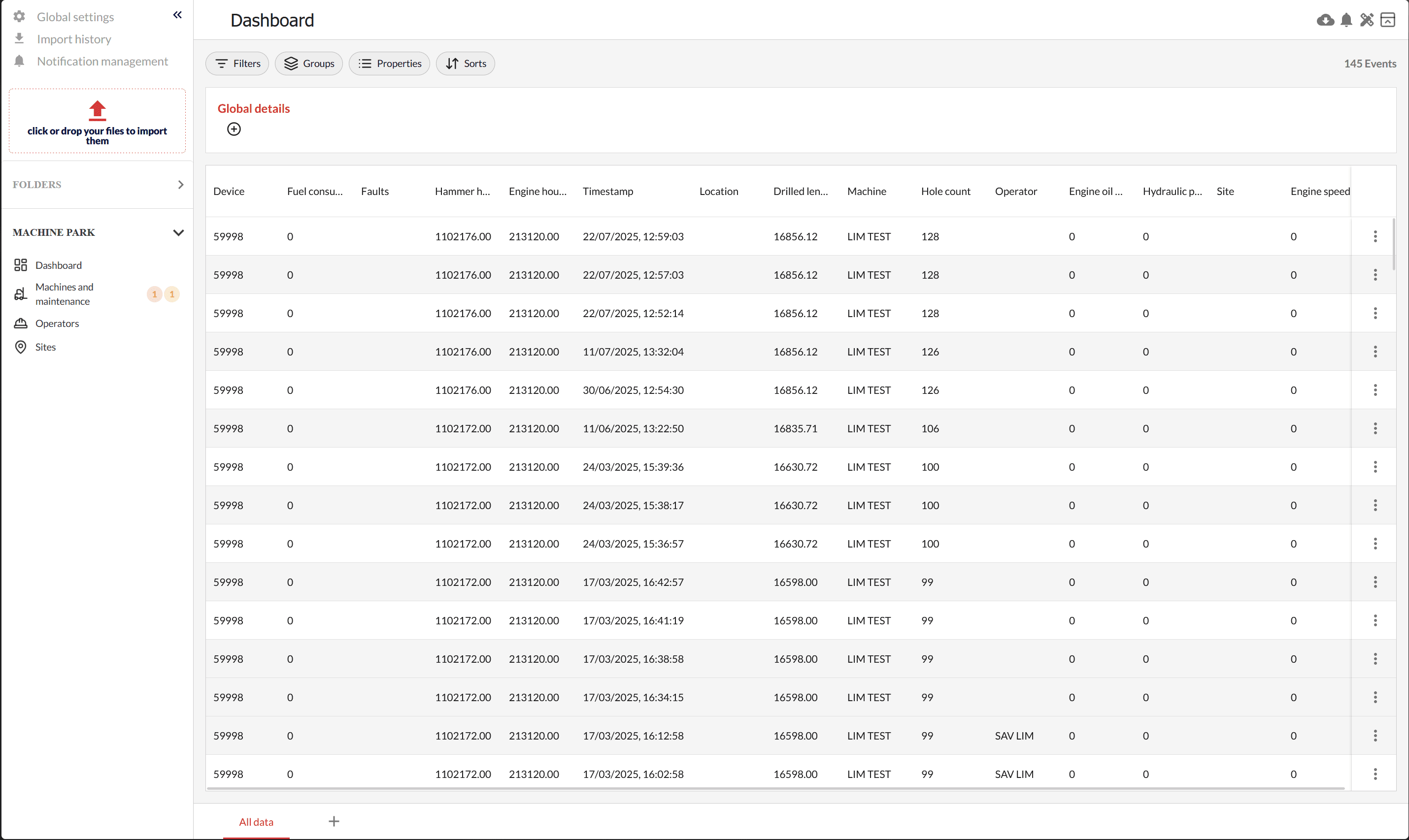
The report editor is divided into three parts:
- Toolbar: The top section contains the report name and action buttons, providing quick access to essential functions. This area is designed to streamline your workflow by offering tools that facilitate report management and customization. Whether you need to export data, manage notifications, or adjust settings, the toolbar is your go-to section for efficient navigation and operation.
- View: The central area where data is displayed and can be interacted with, allowing users to manipulate and analyze their information effectively. This section is the heart of the report editor, where you can apply various filters, sorts, and groupings to tailor the data presentation to your specific needs. The view is designed to be intuitive and user-friendly, ensuring that even complex data sets can be easily managed and understood.
- Sheets Bar: The bottom section allows navigation and management of sheets through tabs. This feature enables you to organize your data into separate sheets, each with its own customized view. You can easily add, edit, or remove sheets as needed, providing a flexible and organized approach to data management. The sheets bar is essential for handling multiple data sets simultaneously, making it easier to switch between different views and analyses.
The Toolbar
 On the left side, you can see your report name. This name can only be edited if you have created a report in the
 Folders section. Otherwise, it defaults to a generic name such as dashboard or folder_name. This feature ensures that your reports are easily identifiable and organized within the app.
On the right side, there are four action buttons:
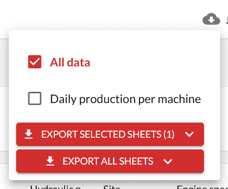
Export
The export action button allows you to export all your sheets (tabs) or select specific ones for export. You can export them in various formats, including PDF, CSV, and XLSX. This functionality is crucial for sharing data with others or for further analysis in external applications. The export feature is designed to be flexible and user-friendly, accommodating different data sharing and reporting needs.
Notifications
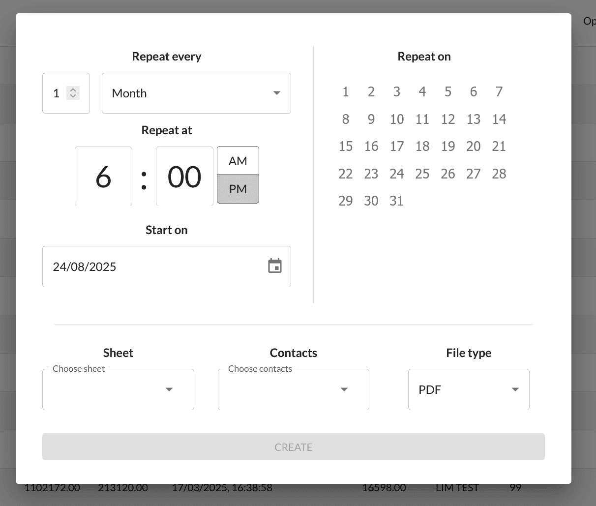
The second button, represented by a bell icon, allows you to create as many scheduled notifications as you need. A notification includes:
- A frequency at which the notification will be sent repeatedly
- A list of sheets that will be included in the notification
- A list of contacts to whom the email notification will be sent
- The file type or format of the sheets that will be sent
This feature is designed to keep you and your team informed about important data updates, ensuring that everyone stays on the same page.
Units Management
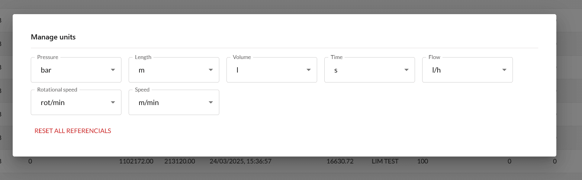
The third button allows you to edit the referential units of your report. The units default to those defined in the global settings, but you can customize them to suit your specific reporting needs. This feature ensures that your data is presented in a consistent and meaningful way, aligning with your organization's standards and preferences.
Expand/Retract
The last button allows you to retract a part of the view to give more vertical space to your data. This feature is particularly useful when working with large data sets, as it maximizes the available screen space and enhances the overall viewing experience.
The Sheets Bar
 Located at the bottom, the sheets bar allows you to edit or add sheets. Each sheet is an isolated view of your data that you can customize. To rename a sheet, you can double-click on it, or right-click to access the sheet edit menu.
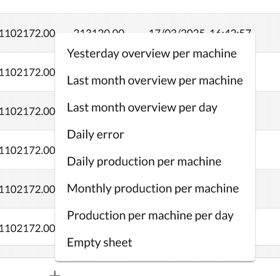
To add a sheet, click on the + button, which opens a popup. You can either add an empty sheet to customize from scratch or select a pre-configured sheet to use as is or edit as needed. The list of pre-configured sheets varies depending on the type of data you are displaying. For example, the options will differ if you are viewing grouting files versus machine events.
The View
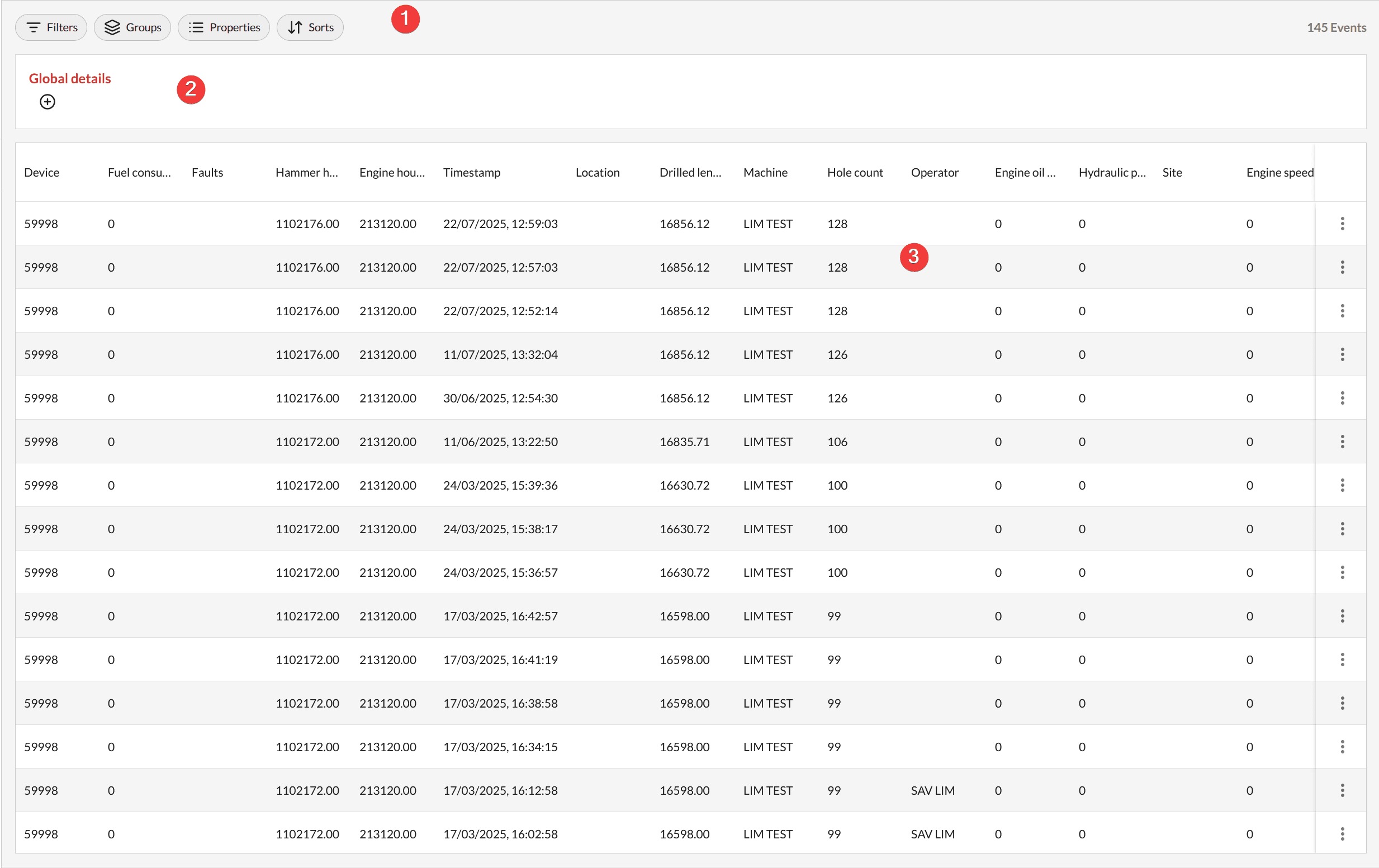
The report's view is the core of the editor. It's where you customize your sheet and display your data. It's divided into three parts:
- The View's Toolbar: This is where you can adjust the display of your data, providing tools for sorting, filtering, and grouping.
- The Computed Details: This section allows you to display computed metrics based on your displayed data. Depending on the grouping, you can have computed details at various levels. To display them, click on the
+button and select your desired computation. - The Data: This is the section where you view your desired data. It is designed to be clear and accessible, allowing for easy interaction and analysis.
Properties
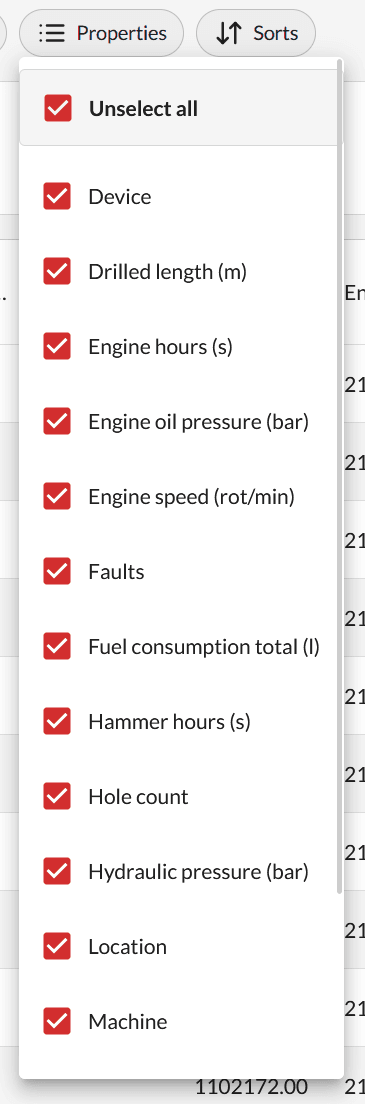
Through the properties button, you can show or hide the columns you want. Depending on the grouping or the data type, the list can change. This feature provides flexibility in how data is presented, ensuring that you can focus on the most relevant information.
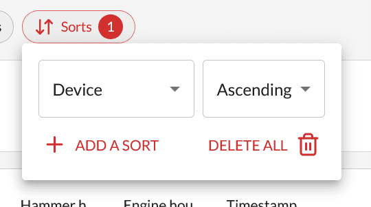
Sorts
To add a sort, click on the Sorts button, then on Add a sort. You can add as many sorts as you need. For each sort added, choose the property you want to sort on, then the direction (ascending/descending). This feature allows for precise data organization, making it easier to identify trends and patterns.
Filters
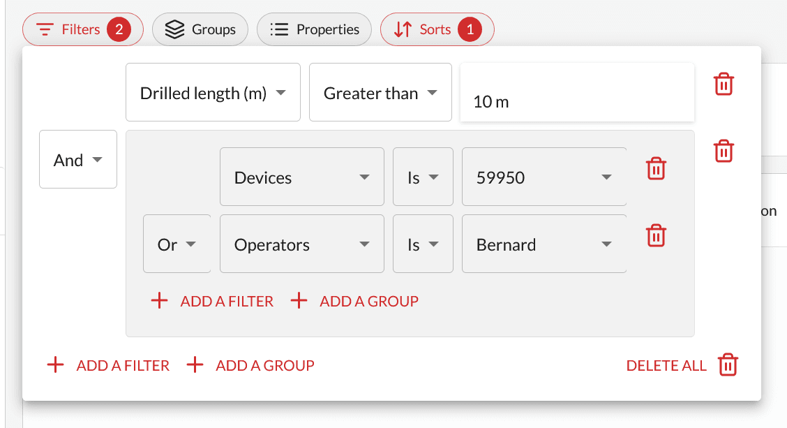
The filters popup may seem complex at first, but it is inspired by popular tools like Notion, ClickUp, and Airtable, bringing the ability to set both complex and simple filters. A filter is composed of three inputs: Property + Operator + Value. The goal is to make filters human-readable and follow human logic. For example, the screenshot above will yield results for: All data with drilled length greater than 10m and where either the device is 59950 or the operator is Bernard. This feature enhances data analysis by allowing you to focus on specific subsets of data.
Grouping
Grouping is one of the most useful features of the report editor. While raw data can be informative, it is often more beneficial to see data aggregated by a specific property. With grouping, you can view the monthly productivity of your machines or the grouted volume per borehole for a given site.
To add a group, click on the Groups button, then Add a group. You will need to choose a group property, and in some cases, an option. In the screenshot on the right, you will notice a group by machine, then by timestamp on a daily basis. This setup allows you to see, for each machine, a table with daily productivity. For more detailed examples, you can add any pre-configured sheet or consult any module's documentation.
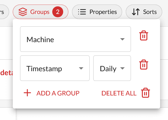
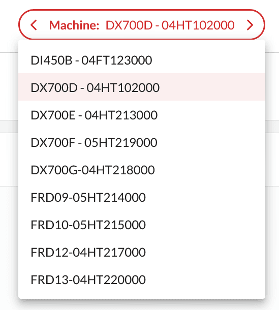
When applying multiple groups, a select option appears, allowing you to switch between the data of your groups. For example, if you group by machine and per day, the table will display daily productivity for each machine, and this select will enable you to switch between your machines. This feature provides a comprehensive view of your data, making it easier to analyze and interpret complex data sets.